I now have the basic machinery of these sites working. The Word Press 2011 theme provides all I need (as far as I can tell at this moment) in terms of putting up posts and pages as well as receiving comments and getting data on site visits. It seemed like it was finally time to add some graphics to give a bit more visual interest to the sites.
I hate pages that come up with most of the computer screen taken up by a picture (or even an animation) on top. It seems to me a waste of space and it forces everyone to click down to see the ‘real meat’ of the site. Since I have no goal of ‘catching’ casual passers-by with the color and pictures of my site, it is the text that I want to feature. I do know to break text up into short paragraphs and add headings or italics/bold/color change to break up long stretches–I recently read a comment post that went on for a good hundred lines of text with no breaks and no identification of subject changes!
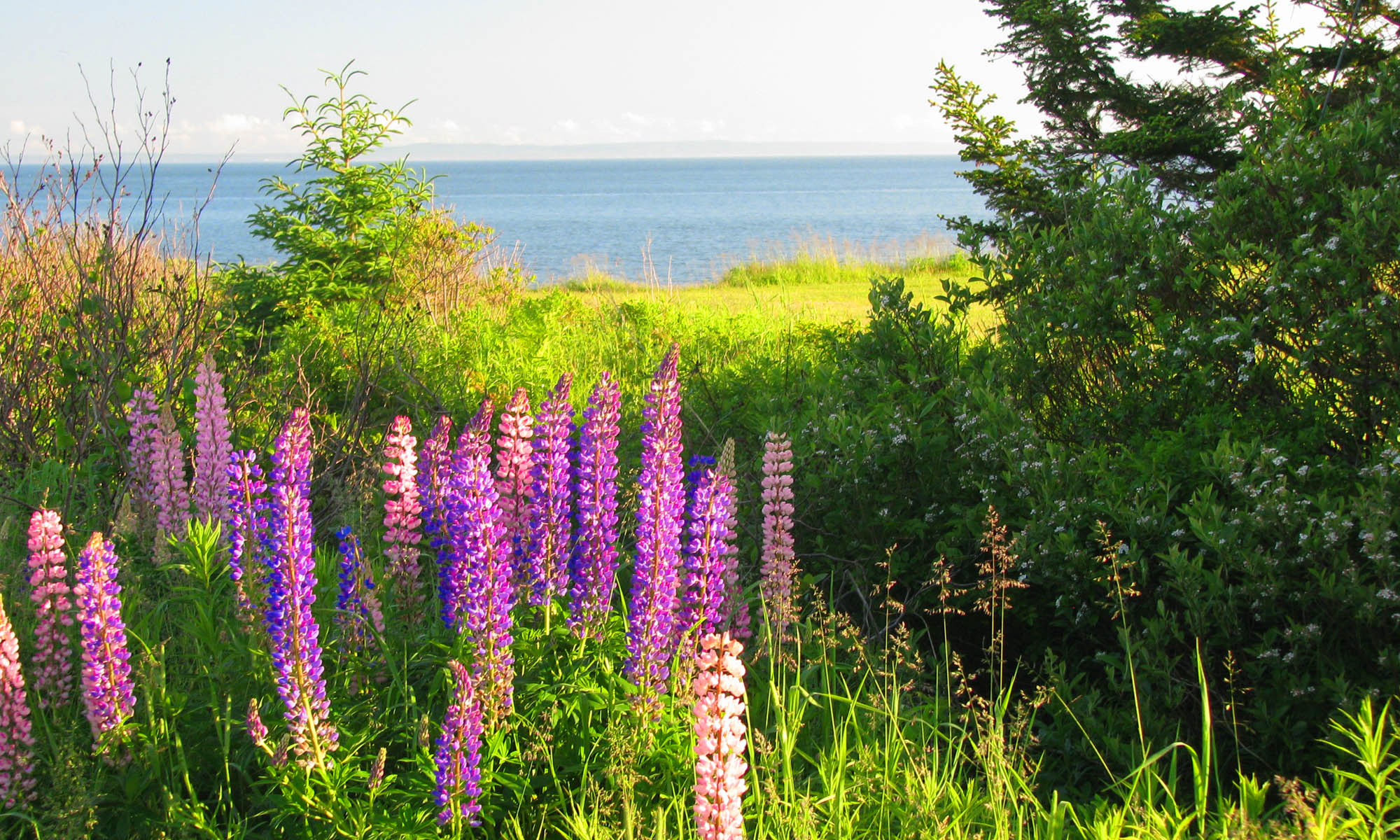
My newest discovery is the ability to insert text into a photo header and eliminate the text otherwise added at the top by the theme. Presto, I can lay out the picture in Photoshop, setting the necessary resolution, drop the text on in with the text tool, and have a mix of picture and text fully under my control! The tool allows any font and any color to be put over the face of the picture as new layers. After it is there you can shift it until it is located just where you want. You can see my result above and at the top of my other three sites.
So web site development is an ongoing process, but I still maintain the first step, before you do any embellishing, should be to get some content up there.
