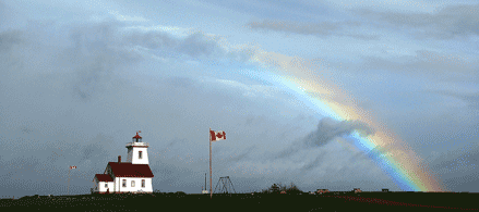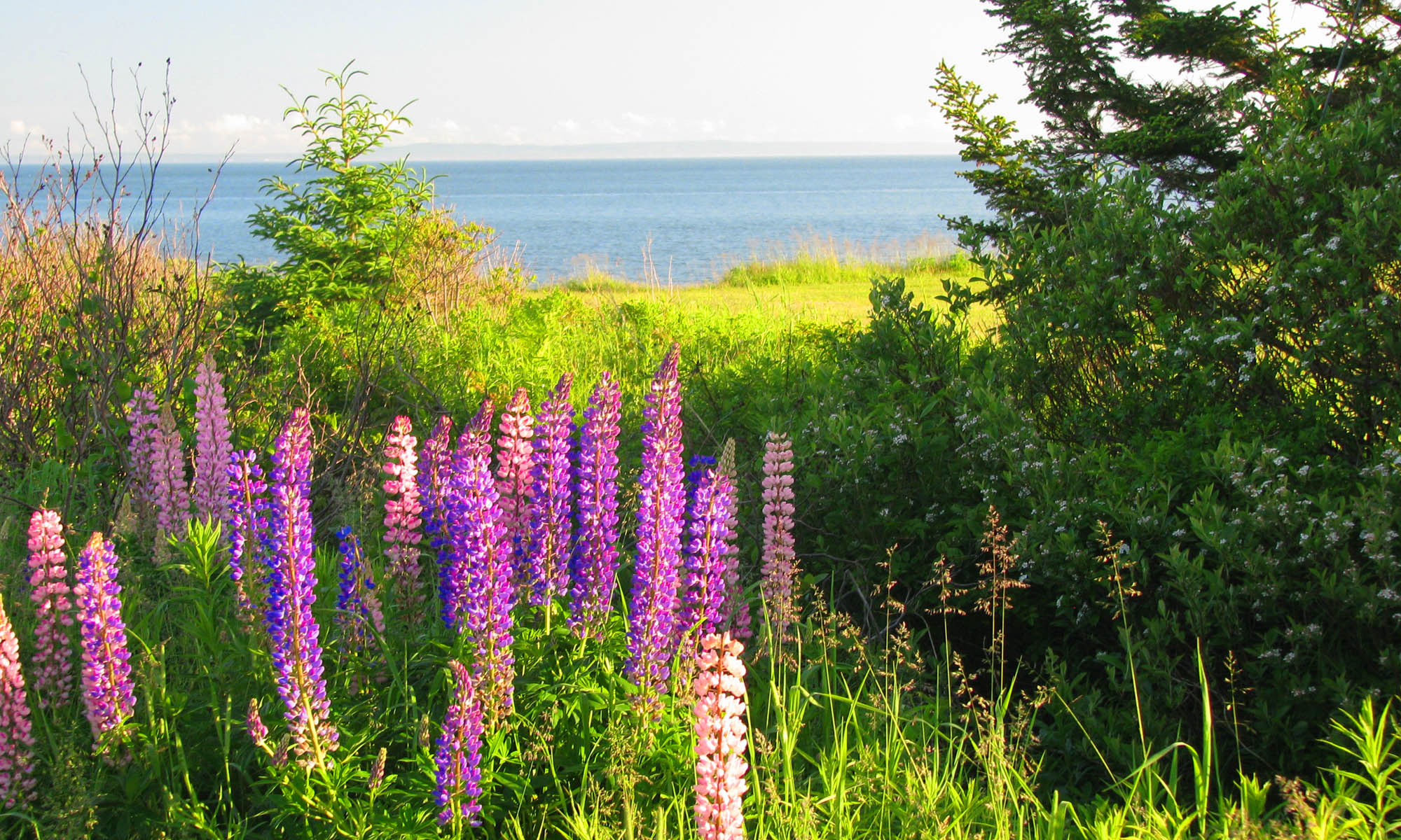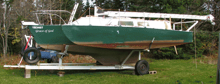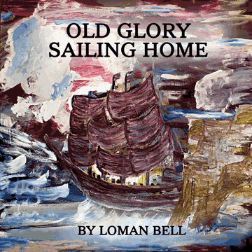
Now that I have decided on the size and fact that the interior will allow colour, I am going through all the photos again… I had spent some time converting them to gray and sized them for a different layout. Since Lightning Source has made the inclusion of inside color much less costly, it seems like the thing to do… especially with a grant from the Southern Kings Arts Council!
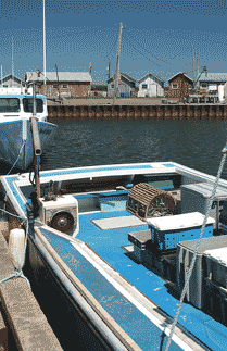
Since 7.44″ x 9.69″ is the largest of the lower per-page cost sizes, I’ll go with that. To pack the most material in with easily-read text lines, I’ll go to two columns. That means I can put pictures in columns with a width of 2.9″ or across both columns with a 6.1″ width… that gives me the width numbers. The height will become whatever is necessary to save the aspect ratio. I expect vertically-oriented photos will go in columns while horizontally-oriented ones will go across the page. Since as soon as one interior page has color the entire thing might as well be so, I plan to use lots and lots of pictures.
The one thing I learned from doing Loman’s first children’s book is that it is possible to set the color too intense/saturated and risk rejection by the printer, I will set the darkness of the pictures up from full “black” along with dropping the “white” down if there are large areas of gradually changing sky…the transition from full white to slightly colored produces visible bands where the printing changes from no ink to a few dots of ink… just make sure there are at least a few dots everywhere… going from a few dots to a few more dots is not so noticeable.
