Preparing the third eBook


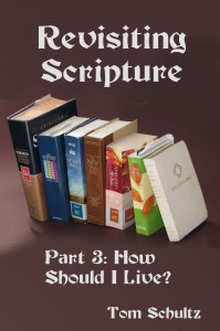
Cover of third Revisiting Scripture eBook

This ought to get easier! It seems to take about 6-7 weeks per section even though the bulk of the entire series was done months ago. There is something intimidating about turning it loose even though eBooks on Kindle can be updated at any time and previous purchasers can download a new version for free. Seeing the number of typos in the first two, I spent more time, with the help of my wife, going over the text with a fine-toothed comb. High praise came when she reported that the last iteration was ‘less bumpy.’

The mechanics of getting to the eBook file format should have gotten easier, but somehow the creation of the table of contents didn’t seem to be working right… I was seeing hyperlinks instead of section headings. I never did find out what was the problem, but when I took it to the html,it seemed just fine! Editing the html in Wordpad went fine… cut out all the font face names and change points to ems. Getting an ISBN is now simple, and the final upload went well. I made up all the covers in advance, so they were ready to go… I have been happy with the way they are readable even on my Kindle Paperwhite… large type and high contrast.

So if any of you want to read more, hop over to my Revisiting Scripture blog or, better yet click here to buy a copy![subscribe2]

5 day free period ended

Kindle select allows 5 free days every 90-day period and I have just ended that time for my first eBook, Revisiting Scripture: Assumptions. According to the reports 524 people took advantage of the offer…no actually 523 since I downloaded a copy also to test it out. And about 100 of you visited the Revisiting Scripture blog site.

While I was publicizing the promotion in every way I knew of, the results were quite gratifying, since I followed a week-long set of info blogs by Ryan Deiss last Fall on how to promote eBooks on Kindle and his demo brought in well over a thousand downloads for a book on gardening…I forget the actual numbers.

The idea is to spread the word by giving it away and then, hopefully, get unsolicited reviews that can convince future buyers that it is a good risk. Of course, ‘risking’ $2.99 is not a big thing, but I find I myself am cautious to spend even $0.99 after having seen some very poorly-formatted eBooks. What really bugs me are the ‘how to’ books that look like they have been tossed together to make a quick buck…usually telling you how you too can grab content from somewhere and soon sit at home watching the $$$ pile up. If the cow isn’t producing enough milk, add to the herd! Somehow I start to feel that I have been milked…or should I say, bilked?

Since I’m well into two years writing this book…or series, for the eBooks…I tried the promotion mainly to try to share what I am discovering in Scripture rather than to make lots of money. The next critical hurdle will be to see how many reviews appear and how the readers evaluate my work. If you have read it, please post a review!

e-Picture formatting

I was talking, with a friend who does web-site layouts, about the huge variety of platforms now requiring attention for an application. No longer can you just size any pictures to read well on a 600 x 800 monitor…no you have to consider HD aspect-ratio display formats, high resolution displays, and now iPads and other tablets, smart phones, and various e-readers…high and low resolution…big and small…portrait or landscape orientation.

I recently ‘bought’ a (temporarily) free book on Kindle, Lexi Fairheart and the Forbidden Door, to see how a picture-oriented children’s book worked on a eReader…a Kindle Paperwhite in this case. I had understood that they didn’t work well on that platform. Reading it on the Kindle app on my laptop, the pictures were in color and looked very good,  but on the eReader, while they were sized OK, the conversion to black& white made them so dark it was impossible to see any detail…I would suppose a change in the brightness of the pictures with an eye to the conversion might have helped. [Also, the same problem I had with fonts on my own eBook plagued this eBook…the choice of font styles was totally overridden although the size could be altered.]

When I now start to configure pictures for eReaders I face the challenge of what resolution to use, what aspect ratio, and how light or dark to make them. Kindle suggests 500 x 700 pixels for interior pictures and something like 1800 x 2500 pixels for covers, but they caution that you should preview all files on the various target devices to make sure you can accept the result. That is well and good but what it dramatically shows for picture/drawing/graph-oriented books, the  highly fragmented viewing market really demands that I prepare different files for each target device. Whatever the capabilities of the operating systems on the devices, they do not intelligently optimize all the various files that they display.

How wonderful it would be if there were a defined standard which, in a single file, would play well across all platforms–probably that is presently impossible…it would require the capabilities of a photo editor program in each device as well as a computer with the graphical layout savvy of a professional designer.